We got to test out the device for a couple of hours before the official launch and it’s certain that Vivo aims to wow people with its design, display, and massive camera sensor. Before we share our thoughts on the device. Let’s take a look at the Nex 3’s impressive spec sheet:
Specifications
Screen: 6.89-inch full HD+ POLED waterfall display Processor: Qualcomm Snapdragon 855+ RAM: 8/12GB Rear camera: 64-megapixel sensor with f/1.8 aperture + 13-megapixel ultra-wide sensor with f/2.2 aperture + 13-megapixel telephoto sensor with f/2.48 aperture Front camera: 16-megapixel with f/2.09 aperture Internal storage: 256GB UFS 3.0 Battery: 4,500 Fast charging: 44W Vivo super flash charging Software: Android 9.0 Pie (Funtouch OS 9.1)
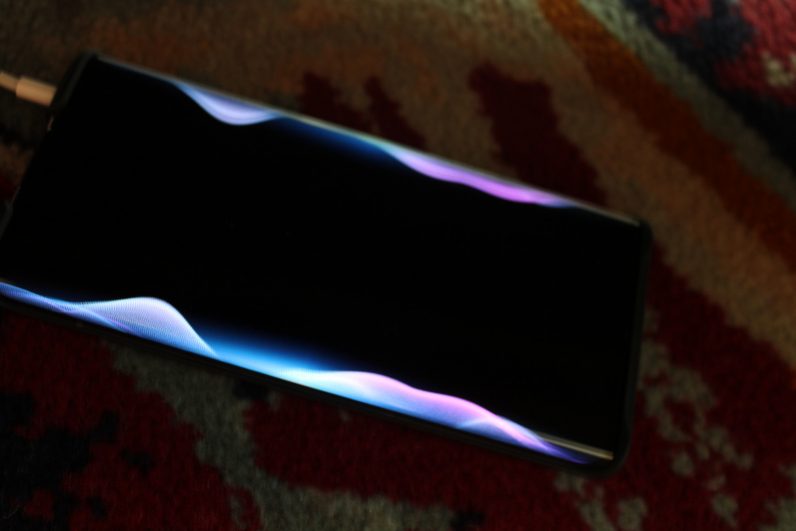
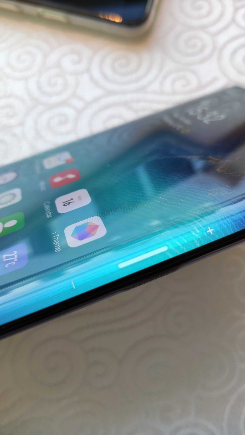
The device is quite large – at 164.77 mm x 76.14mm x 9.4 mm, it’s taller, thicker, and slightly narrow than the Samsung Galaxy Note 10+. We’ve already seen great displays this year with the OnePlus 7 Pro’s QHD 90 Hz screen and the Asus ROG II with a full HD 120 Hz screen. Plus, there’s Samsung’s new Note10 series – rated A+ by DisplayMate. While the waterfall screen makes the phone really pretty in terms of look, it doesn’t match up to standards set by the aforementioned phones That doesn’t mean the Nex 3’s screen is bad by any means. It’s bright (goes up to 800 nits of brightness), big and bezel-less. So, coupled with the dual-speakers it’s a delight to watch videos or shoot some footage. The company said its palm rejection software will avoid to detect any accidental touches and ignore them. The edges don’t make a tangible difference to the viewing experience. The device has an ambient light mode that uses these edges to alter user of a call or notification, or animate them when you’re playing music.
The company says it has increased the working area of the in-screen fingerprint sensor and also made it faster to respond. But in the short amount of time that I used it, I couldn’t really see improvement in either areas. Vivo has made the Nex 3 without any buttons; instead, there are seven pressure sensors on the side to emulate power and volume buttons. There are indicators on the screen as to where these ‘buttons’ are located. It might not be a popular choice at first, but people can get used to that.
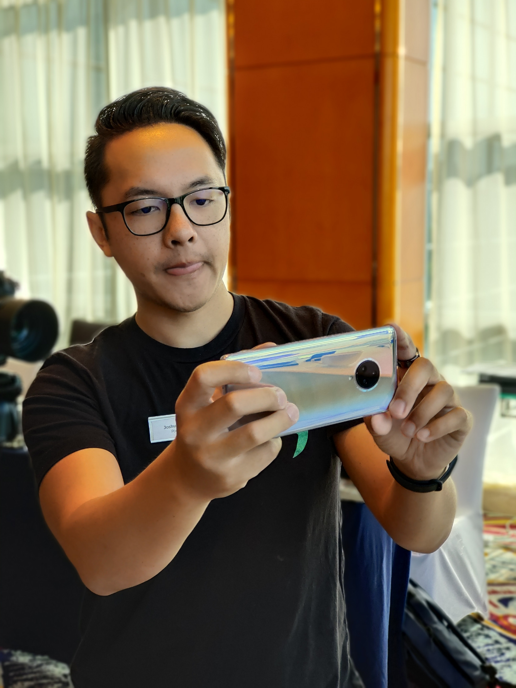
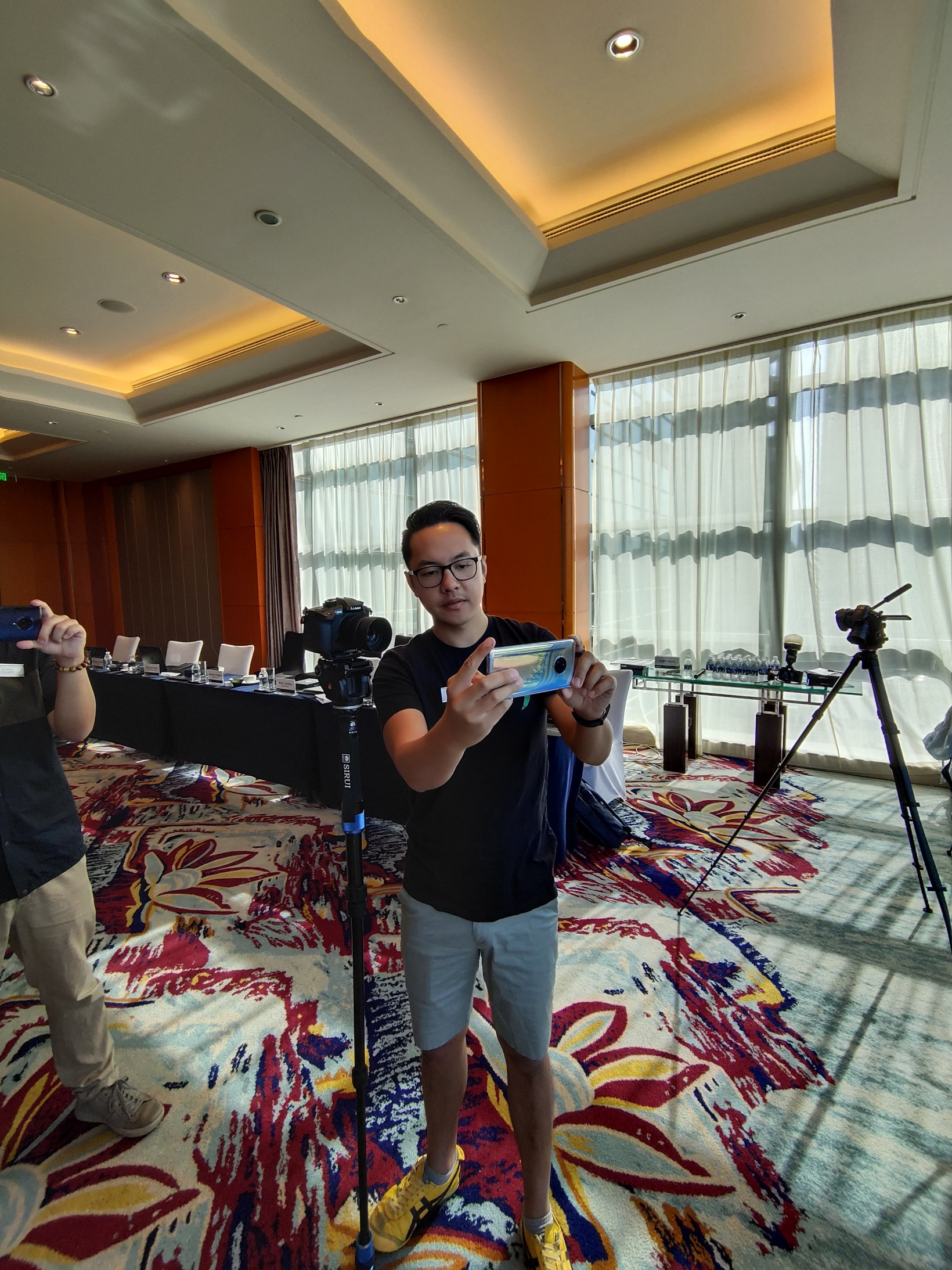
The triple camera setup provides good amount of versatility to shoot photos. But, in a short hands-on time, it was hard to determine if the 64-megapixel sensor would really be effective as compared to other flagships, which has a primary sensor with a lower megapixel count. It’s the same Samsung sensor used by the Xiaomi Redmi Note 8 Pro and the Realme XT, but Vivo says it has made changes to its algorithm for better performance. We’ll be only able to test that out when we get our review unit. Apart from the wide-angle lens, the macro mode which lets you snap photos of objects as close as 2.5 cm is a welcome addition to the device. Here are some sample shots from the Vivo Nex 3: It’s clear that Vivo is banking on a bezel-less screen with 99.6 percent screen-to-body ratio and a triple-camera setup with a 64-megapixel primary sensor to entice users to buy the phone. It’s hard to say if that’ll be true with just a couple of hours with the device. Stick around for our full review on Plugged. Disclaimer: The writer was in China on Vivo’s invitation.
